How to add hamburger menu in post pages of Blogger Emporio Theme
witten2021/1/20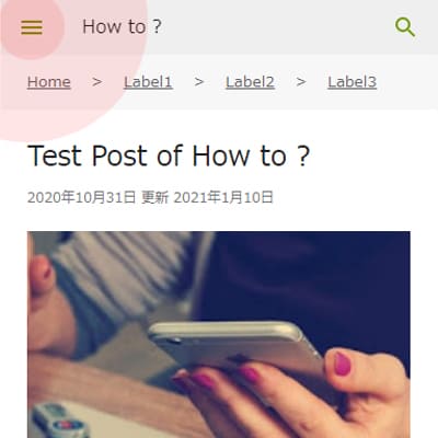
Hamburger Menu Icon button is becoming necceseary material on website because it is installed in any site and everybody is getting used to it. Therefore I have decided to add the hamburger icon in all pages including post pages and unifie the contents of sidebar which originally is separated in feed view and item view. From usability point and desing point of view the content menu should be unified in all pages. In this article I am going to show you how to add hamburger menu to post page and unify sidebar contents both in feed and post view.
Method of adding hamburger menu in post page in Emporio template
Hereunder the methods I introduce you today
- Method 1:Add Hamburger menu icon
- Method 2:Add Hamburger menu icon and delete Return link arrow
- Method 3:Add Hamburger menu icon in the location of deleted Return link arrow
Code that displays hamburger menu
To start with first I am showing you the code that indicates which page to display hamburger icon. You can find this by typeing "return_link" in the html editor's search box.
<b:b:if cond='data:view.isSingleItem'>
  <a class='return_link' expr:href='data:blog.homepageUrl'>
    <b:include data='{ iconClass: "touch-icon back-button rtl-reversible-icon" }' name='backArrowIcon'/>
  </a>
<b:else/>
  <div class='hamburger-section'>
    <b:include data='{ iconClass: "touch-icon hamburger-menu" }' name='menuIcon'/>
  </div>
</b:if>
<b:if cond='data:view.isSingleItem'> tag indicates the action in single page, post page. you can see "return_link" written in there Therefore the return to index link, the back arrow icons is displayed in post page.
<b:else/> tag indicates the action in any pages except single page, post page, and you can see there is hamburger-menu written insie therefore the hamburger menu is shown in feed page, label pages, search result pages and any pages which are not post page.
So, it means we can make hamburger menu displayed in post page as well by making a little change to the conditional tags.
Method 1:Add Hamburger menu icon

To display hamburger menu in any pages make sence to viewers but to display return link to anypages make viewers confused because why would they need return to index link when they are viewing index page ? So we could make another conditional statement to make return to index button disappeared in index page. To do that see the code I created hereunder
<b:if cond='not data:view.isHomepage'>
  <a class='return_link' expr:href='data:blog.homepageUrl'>
    <b:include data='{ iconClass: "touch-icon back-button rtl-reversible-icon" }' name='backArrowIcon'/>
  </a>
</b:if>
  <div class='hamburger-section'>
    <b:include data='{ iconClass: "touch-icon hamburger-menu" }' name='menuIcon'/>
  </div>
Put this code instead. the first line <b:if cond='not data:view.isHomepage'> designates any page except index page to display return link. For the hamburger menu there is no page designation that means it will be displayed in any pages. The 1st method is complated.
Method 2:Add Hamburger menu icon and delete Return link arrow
<div class='hamburger-section'>
  <b:include data='{ iconClass: "touch-icon hamburger-menu" }' name='menuIcon'/>
</div>
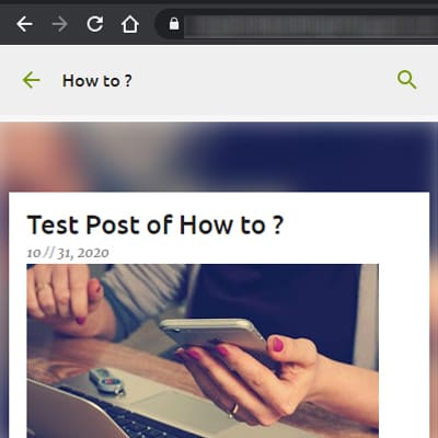
Leave these 3 lines and delete the rest. By doing this the return link arrow is completely removed and only hamburger menu will be shown without any designation. Appearance will like the above picture. This is very common placement.
Step 3:Display sidebar close button in post page sidebar
And this is the most familier placement of hamburger menu. To complete this implement first complate the method 2 written above section and after that adjust the codes shown bellow.
Adjust the placement order in Header bar
.sticky .centered-top .hamburger-section{
-webkit-box-ordinal-group:5;
-webkit-order:4;
-ms-flex-order:4;
order:4
}
.sticky .centered-top .hamburger-section{
-webkit-box-ordinal-group:2;
-webkit-order:1;
-ms-flex-order:1;
order:1
}
Adjust the placement order in Index page
.centered-top .hamburger-section{
display:none;
-webkit-box-flex:0;
-webkit-flex:0 0 auto;
-ms-flex:0 0 auto;
flex:0 0 auto;
-webkit-box-ordinal-group:4;
-webkit-order:3;
-ms-flex-order:3;
order:3
}
.centered-top .hamburger-section{
display:none;
-webkit-box-flex:0;
-webkit-flex:0 0 auto;
-ms-flex:0 0 auto;
flex:0 0 auto;
-webkit-box-ordinal-group:2;
-webkit-order:1;
-ms-flex-order:1;
order:1
}
Adjust the css for icon padding
.centered-top .blog-name,.centered-top .hamburger-section,.centered-top .search{
margin-$startSide:16px
}
.centered-top .blog-name,.centered-top .hamburger-section,.centered-top .search{
margin:0 16px
}
just like this and that's it ! you have completed the method 3.
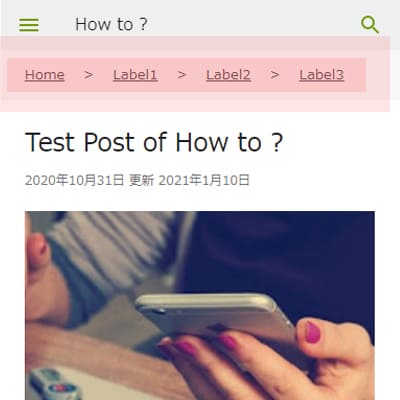
Here above I showed all 3 methods of how to implement hamburger menu to post pages in Blogger Emporio Template. Check the actual view of your page in a mobile or pc brower frame scale smaller than 745px and if you see the humburger menu then you are succeeded.
Make Sidebar works properly when hamburger menu is activated
After you finished placing hamburger menu you realize that the hamburger menu button is not working properly. You need this another process to make it work fine. The method will be shown hereunder...
- Change the sidebar position setting
Notice that sidebar gets activated when you press the menu button although it goes wrong direction. so need to edit the existing css. - Change the class to control the actiation timing of sidebar
After you change the sidebar position setting and reflesh the page you will notice that the sidebar is opened and covered the entire screen at first sight. so we need to controll this by adding another class to sidebar. - Place the close button to the sidebar in post page as well.
Adter you have done above 2 things the sidebar works fine but then you will notice that there is no close button for opended sidebar, so we need to make the close button also diplayed in post page as well as it is displayed in feed view.
- Unifiy the sidebar contents in both feed view and post page.
- Unify the designating scale of the hamburger menu and sliing sidebar appearing timing.
Step 1:Adjust the position of sidebar
.item-view .sidebar-container {
float:none;
margin:0;
max-height:none;
max-width:none;
padding:0 15px;
position:static;
width:100%
}
withing this css erase the position line completely and the sidebar position will be normal just by doing this.
Step 2:Control the sidebar trigger
after you've done step 1 and relaod the page the sidebar appears in front and covering what is behind so nothing else you can see. This has to be closed at the first stage of opening the post page and needs close button also. You can check why it is happening by browers inspecting tool and as a conclusion you just got to do what is shown bellow
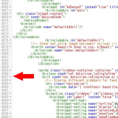
<aside class='sidebar-container container' role='complementary'>
<b:class cond='not data:view.isSingleItem' name='sidebar-invisible'/>
In the template HTML the css, ".sidebar-invisible", for sidebar in post page is missing. it is only inpleent to feed view sidebar therefore the sidebar is expanded at the first stage of opening the post page. So to implement this class to the post sidebar as well you need to take ou the "sidebar-invisible" in the second line and implement in the 1st line class and erase <b:class cond='not data:view.isSingleItem' name=''/>, the remaining 2nd line. So there should be only 1 line such as bellow.
<aside class='sidebar-container container sidebar-invisible' role='complementary'>
this is it. Now the class "sidebar-invisible" is given to any pages and by this the sidebar is hidden at the initiate stage and will appear by clicking hamburger menu icon button.
Step 3:Display sidebar close button in post page sidebar
So as the hamburger menu was not placed originally the close button was not placed either. Now the hamburger is displaed and sidebar is active all we need is the close button. For that we will be looking at the following codes
<b:if cond='not data:view.isSingleItem or data:view.isLayoutMode'>
<!-- Display different sidebars for feed page / item page. -->
  <div class='navigation'>
    <b:include data='{ iconClass: "touch-icon sidebar-back" }' name='closeIcon'/>
  </div>
<b:section class='sidebar' id='sidebar_feed' name='Sidebar' preferred='yes'>
<div class='navigation'>
  <b:include data='{ iconClass: "touch-icon sidebar-back" }' name='closeIcon'/>
</div>
This part is the close button code. It is included in the conditional tag of <b:if cond='not data:view.isSingleItem or data:view.isLayoutMode'> means except post page and layout page. So let's just remove this conditional statement. To remove this conditional statement you need to becareful because the tag includes many code in between, so to avoide mistake press the arrow icon appearing at the left edge of the line <b:if cond='not data:view.isSingleItem or data:view.isLayoutMode'> then the entire codes tagged within this conditional statement are closed
and now you only see 1 line just like this, <b:if cond='not data:view.isSingleItem or data:view.isLayoutMode'>←→</b:if>. Now carefully avoid touching the "←→" part and delete <b:if cond='not data:view.isSingleItem or data:view.isLayoutMode'> and </b:if> only. So now only the purple colored "←→" is remaining. Save the temeplate. This is it. Now the conditional statement for sidebar is removed and the sidebar close button is displayed in any pages.
Step 4:Unify the contents in sidebar
Now you might wonder 1 thing that now the sidebar conditional statement for feed view is removed then what is the point of remaining the sidebar conditional statement for post page ? It seems only increasing the site DOM. if you want to certain contents in the sidebar then you could add "cond='data:view.isMultipleItems'" or "cond='data:view.isSingleItem'" to indivisual widget. Can't find the reason why it is separated like this so let's remove the conditional statement for post page as well.
<b:if cond='data:view.isSingleItem or data:view.isLayoutMode'>
<b:section id='sidebar_item' name='Sidebar (Item Page)'>
<b:if cond='data:view.isSingleItem or data:view.isLayoutMode'>←→</b:if>
This time we don't need double sidebar so delete entire line. That is it. Sidebar is now complately removed.
Visit you site and check if everything is working fine. As original CSS setting the hamburger menu appears at the screen scale of smaller than 745px and the sidebar slides ath the scale of smaller than 680px. If the slide appears at the resolution then you have suceeded.
Step 5:Unify the screenn scale which allows hamburger menu and hidden sidebar appear
Wait a minuite the hamburger menu icon appears at 745px scale but the sidebar only gets activated at the scale of smalled that 680px ? This gives condusion to viewers if anyone visit the site with device with resolution scale between 745px and 681px. So to unify the activating timing change the following css.
.centered-top .hamburger-section{
-webkit-box-align:center;
-webkit-align-items:center;
-ms-flex-align:center;
align-items:center;
display:-webkit-box;
display:-webkit-flex;
display:-ms-flexbox;
display:flex;
height:48px;
margin-$endSide:24px
}
This is designates at what scale to display the humberger menu icon. copy and delete all then paste to the end of the css with adding 680px screen designation.
@media (max-width: 680px){
.centered-top .hamburger-section{
-webkit-box-align:center;
-webkit-align-items:center;
-ms-flex-align:center;
align-items:center;
display:-webkit-box;
display:-webkit-flex;
display:-ms-flexbox;
display:flex;
height:48px;
margin-$endSide:24px
}
}
Just like above and completed.
Step 6:Adjust the sidebar slide direction
Now you have hamburger menu on top left but the sidebar appears from right side which gives kind of odd feeling to viewer. Let's change the sliding direction by changing the following code shown bellow.
.sidebar-container.sidebar-invisible{
-webkit-transition-timing-function:cubic-bezier(.4,0,.6,1);
transition-timing-function:cubic-bezier(.4,0,.6,1);
-webkit-transform:translateX(100%);
-ms-transform:translateX(100%);
transform:translateX(100%)
}
change all the 100% to -100%
.sidebar-container.sidebar-invisible{
-webkit-transition-timing-function:cubic-bezier(.4,0,.6,1);
transition-timing-function:cubic-bezier(.4,0,.6,1);
-webkit-transform:translateX(-100%);
-ms-transform:translateX(-100%);
transform:translateX(-100%)
}
Just like above look at where the red eavy underlines are. By rewriting only these numbers the sidebar slides from left and gives natural motion. Edditionallly let's change the width of the sidebar only when it appears with this sliding action.
.item-view .sidebar-container{
float:none;
margin:0;
max-height:none;
max-width:none;
padding:0 15px;
width:100%
}
Just change the code's last line value to any number less than 100% such as 90%. Now you can see the the post page behind the sidebar from the gap created in the side of the sidebar which looks cool. Now change the gap space to the right side from left side. Just rewrite following code shown bellow.
.sidebar-container{
bottom:0;
position:fixed;
top:0;
left:auto;
right:0
}
Rewrite the last 2 lines as such shown bellow...
.sidebar-container{
bottom:0;
position:fixed;
top:0;
left:0;
right:auto
}
That's it.
Now you have finishded all the process and you blog looking even better !
Conclusion of installing the hamburger menu icon in Blogger Emporio Theme
Not only writing a post but editing Blogger template is also one of the enjoyment of blogger. Specially when you have an image to design your blog you could spend days to edit the desing, can't you ? Blogger is a fantastic service that provides all the enjoyment of creating you own world blog. Many blog remplates are structured with densed dsign but Blogger, the world leading Google's Blogger templates are very simple and easy on the eyes. As long as the service continues let's preffer using blogger.
The Reason why I install hamburger menu icon
Before I actually didn't really think the hamburger menu icon was neccesary becuase blog page viewers come for instance and viewers are not expecting further subdivided infomation to be contained in hamburger menu, even if thhey are the contents should be exposed rather than put inside hamburger menu. Or I even thought "does anyone press hamburger menu in the first place ?". But as time goes by the hamburger menu became familier as it is seen in any site and apps and it almost giving a sence that whethere it is needed or not it should be placed otherwise the site doesn't look sufficient. You now ? the way look at the hamburger menu has changed now so to implement the hamburger menu is not hard why not to have one in my blog as well ? If anyone who is familiar to using hamburger menu might check and stay longer.
The Reason why I think return link arrow is not needed
Do we really need Return arrow icon, the back to index link ? I personaly don't think so.
- Because I put breadcrumbs to my blog. In the breadcrumbs the index link is displayed already so the return link is overlapping. It is better to show the index link in breadcrumb because it is literally written the link destination and viewers know where they are going clearly
- Although I see return arrow in major site like facebook and google developer site I don't usually see it in other websites which tells me that it is not so much common to place the return arrow yet.
- Usually in the where return link is places there is the hamburger button instead so it is better to follow the usual design for viewers.
- I personally think the return link button gives confusion because the brower has also the return arrow button and the site return arrow takes viewer to the index of the site but the brower's return arrow takes viewer back to the previous page. Viewer might think they could get back to previous page by clicking the return arrow in the blog.
In the first place would anyone not knowing which page they are reading and how to go to index page ? I believe everyone knows how to get to index page without seeing return to index arrow icon.
However If the return to index arrow icon become common thing to be placed then that would be the day I display the return to index arrow icon. There can be more opinions to learn untill then today's mission is completed !